








- 21st Century Business Herald: AI and CTV Become Core Growth Engines for Digital Marketing in Overseas MarketsNov 18, 2026View details
- China Presents 25 Cooperation Outcomes in Areas Including Cross-Border E-Commerce During APECNov 18, 2026View details
- AI Products Drive Hong Kong Exports Up 64.9% in September, Fastest Growth in Over 40 YearsNov 17, 2026View details
- National Bureau of Statistics: Foreign trade grew rapidly in October, providing stable support for global tradeNov 17, 2026View details
- The U.S. has ended the $800 de minimis exemption for non-postal shipments; express courier packages must be formally declared.Nov 16, 2026View details
- ASEAN Signs Digital Economy Framework Agreement, Moving Toward Harmonized Cross-Border E-Commerce RulesNov 15, 2026View details
How to Design a High-Converting Landing Page: From Above-the-Fold Content to Form Submission Paths
Define “conversion” clearly first, so the above-the-fold section stays on track
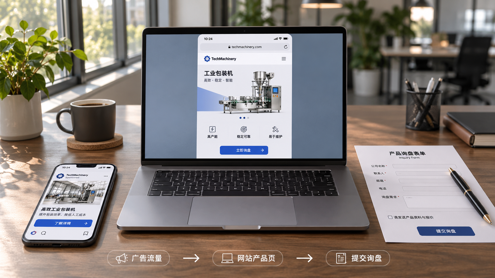
The task of a high-converting landing page is usually very focused: getting a specific type of visitor, arriving from a clear source with a clear intent, to complete one action. For B2B export websites, this action is often submitting an inquiry, booking a consultation, requesting a quote, or downloading materials; for cross-border retail pages, it may be adding an item to the cart or placing an order directly. If the page also asks visitors to learn about the brand, browse all products, read the company story, and subscribe to emails, the action path becomes diluted.
Users arriving through search ads, social media ads, and organic search do not have the same level of patience when they enter a page. Ad visitors will check whether “the page delivers on the promise I just clicked”; search visitors care more about “whether this solves my problem exactly.” Therefore, the optimal landing page does not follow a fixed layout. Instead, it keeps the traffic source, page promise, and conversion action aligned.
Before starting the design, operators should first clearly write down three sentences: Where does the visitor come from? What problem are they trying to solve? What do you want them to do next? For example, if Google Ads are placed around a certain type of industrial equipment, the landing page should focus on the equipment's specification compatibility, delivery capability, and quotation request, rather than placing extensive homepage-style category navigation in the main visual area. The more focused the page, the more reliable subsequent data analysis will be.
Achieve understanding above the fold before seeking clicks
The above-the-fold section does not need to carry every selling point, but it must answer three questions quickly: What is this? How does it benefit me? What can I do next? The problem with many pages is not that the visuals are insufficiently refined, but that the headline contains only vague statements such as “professional solutions” or “quality service provider.” Visitors cannot tell whether the product relates to their purchasing needs, job responsibilities, or business stage, so they naturally will not continue reading.
A more actionable sequence for above-the-fold information is: first, use one sentence to explain what is offered and who it serves; then use two or three verifiable points to provide the basis for evaluation; finally, present one primary action entry. For manufacturing B2B inquiry pages, the headline can directly state the product category, applicable industry, or capability scope; supporting information can include materials, customization scope, certifications, minimum order quantity, and methods for discussing lead times. Do not use unproven claims such as “industry-leading” or “the global first choice” as value propositions.
The call-to-action button above the fold should also match the visitor's stage. Visitors still comparing options will usually find “Get selection guidance” or “View specification materials” more acceptable than “Buy now”; users who enter through specific model or quotation-related terms should be able to request a quote directly. A page can have secondary entry points, but the color, placement, and copy of the primary button should remain consistent, avoiding multiple equally prominent buttons that force users to reconsider.

Information and proof should follow the decision-making sequence
The above-the-fold section attracts visitors to keep reading, while the trust built in the middle of the page is what truly drives submission. B2B purchasers or business professionals will not submit their company email based solely on a selling point. They will continue assessing whether the product is a match, whether the supplier is reliable, and whether they can receive a valuable response after leaving their information.
Therefore, subsequent landing page content should be organized according to the user's evaluation sequence, rather than according to the catalog of internal departments or promotional materials. A common sequence is: pain points or use cases, how the product/service responds, key specifications and delivery boundaries, qualification or process proof, and finally the submission action.
- Make scenarios specific. Rather than listing “widely used across multiple industries,” explain the operating conditions, procurement purposes, or business stages for which it is suitable; boundaries where it is not applicable can also be stated appropriately.
- Make proof easy to verify. Use clear specifications, process flows, service steps, publicly available qualification information, and physical product details. Vague icon walls, unattributed reviews, or stacked adjectives are unlikely to reduce decision-making concerns.
- Match content depth to the action. High-value, non-standard, or internally approved purchases should provide enough information to support an initial assessment; low-barrier trials or standard product purchases should shorten the reading path.
Some companies use research materials, white papers, or toolkits as intermediate conversion content to engage users who are not yet ready to request a quote. For example, a page aimed at financial management and manufacturing business audiences may offer Research on Liquidity Risk Management Strategies for Manufacturing Enterprises as an optional entry for further reading, but it should not take over the primary action on a product inquiry page. The role of content assets is to lower the barrier to leaving contact information, not to add a seemingly relevant link to every page.
A form is not necessarily better when shorter; visitors need a reason to fill it out
“The fewer form fields, the higher the conversion rate” is true only in some scenarios. Too many fields do increase the effort required to complete a form, but if only a name and email are collected, sales or operations personnel will still need to repeatedly ask about product models, purchase quantities, target markets, and contact details afterward. Low-quality leads can consume follow-up resources. For businesses requiring manual quotations, forms should prioritize collecting information that affects the quality of the initial response.
Fields can be divided into three levels. The first level contains information necessary for contact, such as name, email, or telephone number; the second contains information that determines whether an effective response can be provided, such as requirement category, region, and estimated quantity; the third contains background information that can be obtained later, such as company size, full address, and budget range. Unless a piece of information directly determines quotation, compliance, or service feasibility, do not make it required on the first submission.
Near the form, visitors should be told what will happen after submission, such as receiving product materials, having relevant personnel confirm their requirements, or entering a booking process. Compared with the blank feedback of “Submission successful,” clearly stating the next step can reduce concerns about spam marketing and ineffective follow-up. For overseas users, telephone country codes, time zones, the language of privacy notices, and the mobile input experience should also be checked to prevent the form itself from becoming an obstacle to cross-regional conversion.
Use path data to identify problems instead of focusing only on the overall conversion rate
After a landing page goes live, viewing only traffic and form submissions makes it difficult to determine where the problem lies. It is more useful to break down the path: whether users leave quickly after clicking an ad, whether the primary above-the-fold button is clicked, at which form field users begin abandoning in large numbers, and whether completion rates differ significantly by country or device. Abnormalities at each stage require different responses.
When optimizing, adjust only one variable that affects the path at a time. For example, first revise the above-the-fold promise, or first remove one non-essential field, then observe changes under the same traffic conditions. If images, headlines, forms, and targeting are changed frequently at the same time, it will be difficult to know which one produced the effect even if the data improves.
A landing page that can continuously generate leads usually has no complex tricks: it enables visitors to quickly confirm that they have come to the right place, gives them sufficient information for evaluation when needed, and allows them to complete a submission at a reasonable cost. Only by designing the above-the-fold section, proof content, and form path as one decision-making chain can a page have the opportunity to turn visits into genuine business opportunities that can be followed up.
Related Articles
 How to troubleshoot a low conversion rate after running Facebook ads?
 How Can You Evaluate the Advertising Performance of a Digital Marketing Service Provider?
 How much does it cost to open a Yandex Ads account? How are the setup fees calculated?

Related Products
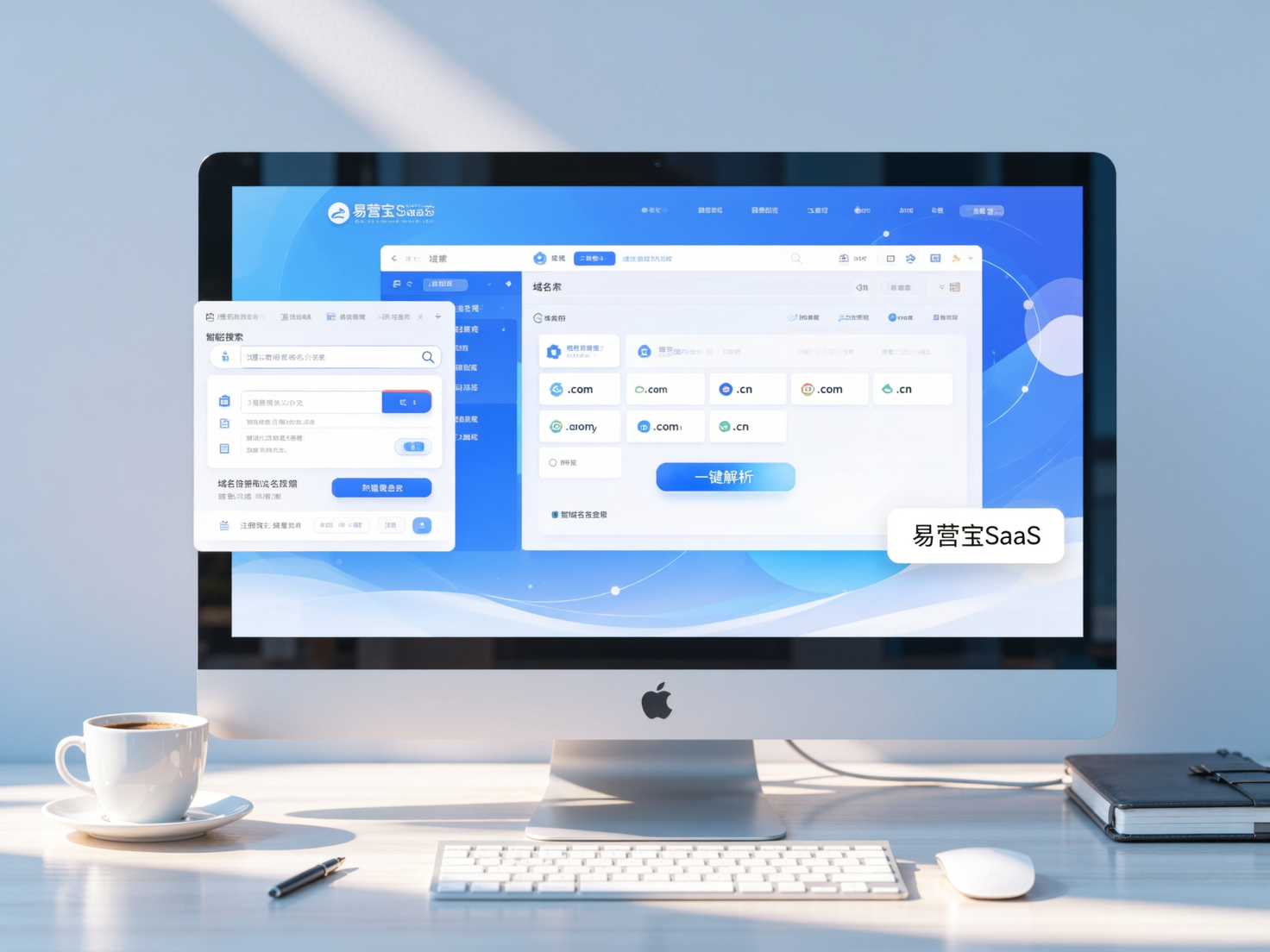
 Yiyingbao SaaS Intelligent Website Building and Marketing SystemYiyingbao SaaS Intelligent Website Building and Marketing System, AI-powered no-code website building, rapid creation of multilingual B2B international websites in 10 minutes, global server acceleration, AI-powered SEO optimization, helping businesses connect efficiently with global markets. The perfect integration of technology and operation makes building an international trade website remarkably simple
 AI+SEM Intelligent Advertising Marketing SystemAI+SEM drives intelligent ad creation, empowering full-funnel precision advertising marketing. The system automatically generates weekly/monthly reports, AI recommends keywords and target countries, monitors core metrics in real-time with intelligent alerts, and enables one-click high-conversion ad solutions to help quickly acquire customers and improve ROI.
 AI+SEO Dual-Engine System Optimization ServicesYiyingbao’s AI+SEO dual-engine optimization system helps foreign trade enterprises acquire high-quality organic traffic through AI-powered keyword research, content generation, and comprehensive technical optimization, significantly improving search rankings and conversion rates.
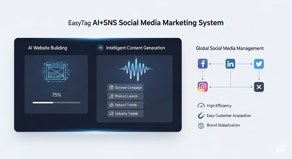
 AI+SNS Social Media Marketing SystemYingbao AI+SNS Social Media Marketing System - Precision social capture for the social media era. Supports one-click content synchronization across major platforms like Facebook and LinkedIn. AI intelligently rewrites posts for enhanced relevance. 24/7 AI customer service and user profiling analysis empower businesses to efficiently expand into global markets.
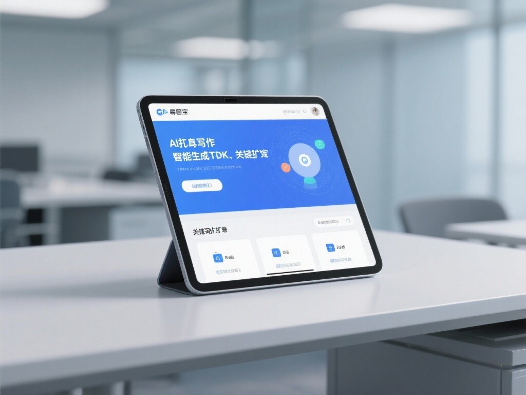
 AI+SEO营销解决方案易营宝AI+SEO营销解决方案,通过AI批量写作、智能生成TDK、精准关键词扩词等功能,全面优化网站SEO效果,提升流量与转化率。助力企业构建高效智能网站新生态。
 AI+SEM Advertising Marketing SolutionsAI+SEM Advertising Marketing Solution leverages AI technology to deeply empower SEM ad campaigns. It automatically generates weekly/monthly reports using AI, presenting account data across multiple dimensions for comprehensive insights into campaign performance and trends. The system precisely recommends keywords and target countries, intelligently generates high-conversion ad copy, and enables one-click activation of efficient campaign plans to help businesses rapidly acquire customers. Simultaneously, it monitors core metrics in real time, intelligently identifies abnormal fluctuations, and issues timely alerts to ensure stable, high-return advertising results.
 Domain Name ServicesEasyWin provides professional domain name services, including intelligent queries, one-stop registration, brand protection, and full lifecycle management, helping businesses build a digital brand image.
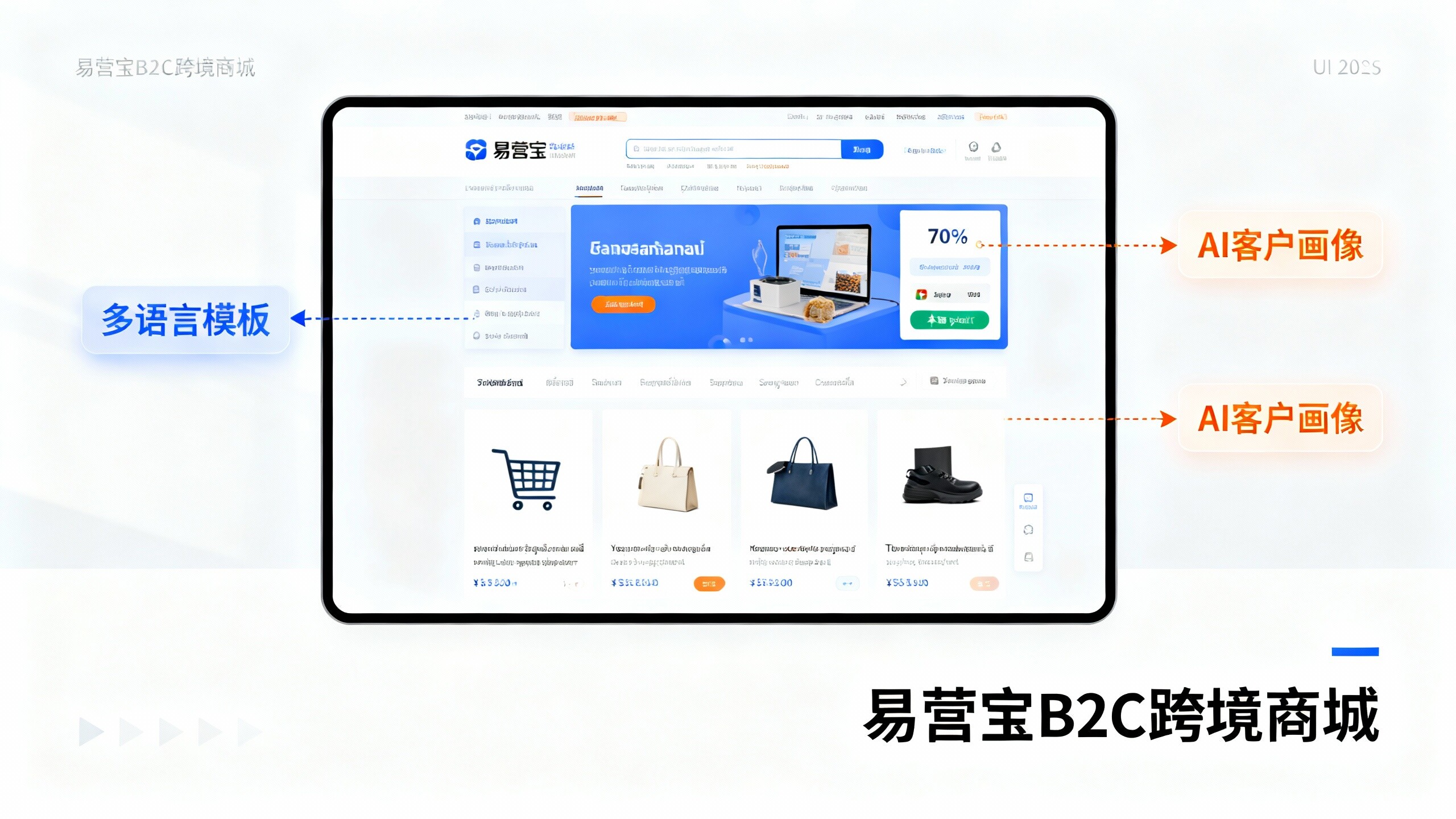
 EasyOperate B2C Cross-Border E-Commerce Platform & Independent WebsiteEasyStore B2C Cross-border E-commerce Independent Store is an intelligent website building and cross-border e-commerce integrated solution independently developed by EasyStore Information Technology (Beijing) Co., Ltd. The system is specially designed for small and medium-sized as well as large export enterprises, integrating 'website building, operation, marketing, advertising, and conversion' into one, helping enterprises quickly establish cross-border e-commerce independent stores to achieve brand globalization and global sales growth.
The platform supports multiple languages, multiple currencies, and multi-channel marketing, with built-in AI intelligent translation and SEO optimization systems, suitable for mainstream markets such as Southeast Asia, Europe and America, Latin America, and the Middle East, assisting Chinese manufacturing enterprises in efficiently deploying international e-commerce strategies. SSL证书易营宝提供专业SSL安全证书服务,包括单域名和泛域名证书,确保网站数据传输加密、身份验证和完整性保护,助力企业建立安全可信的在线业务环境。