








- Maersk Adjusts Middle East Emergency Operating Cost Recovery Surcharge to USD 2,000 per ContainerOct 30, 2026View details
- Ministry of Commerce: Online retail sales grew 4.4% in the first three quarters, while cross-border e-commerce maintained relatively rapid growthOct 29, 2026View details
- CCTV reports: AI-powered smart hardware is expanding overseas at a faster pace, with orders for some best-selling products booked through next yearOct 29, 2026View details
- Alphabet Q3 Earnings: Google Search Advertising Revenue Rises 10.5% to $82 BillionOct 29, 2026View details
- AliExpress Announces New Service Rules for Russia, Linked to Wildberries Product IntegrationOct 28, 2026View details
- Black Friday Preparations Enter the Final Sprint Week as Cross-Border E-Commerce Platforms Roll Out Their PlansOct 28, 2026View details
How Reliable Are the Google Mobile-Friendly Test Results?
Mobile responsiveness assessment: do not treat the test result as the final conclusion
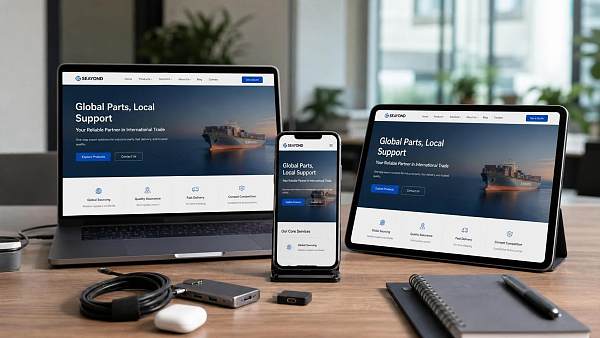
Is Google Mobile-Friendly Test an accurate way to assess mobile responsiveness? The answer is that it provides useful reference information, but it should not be used to reach a conclusion on its own. It is suitable for an initial screening, especially before a website goes live, after a redesign, or when checking a large number of advertising landing pages. It can quickly identify basic issues such as fonts that are too small, click elements that are too close together, and content extending beyond the screen.
The real challenge is that testing tools determine whether a page has basic mobile usability, rather than whether it has genuine conversion potential. For websites that rely on overseas customer acquisition, mobile responsiveness affects not only crawling and indexing, but also directly impacts time on site, bounce rate, form submissions, and the quality of advertising campaigns.
This issue is even more apparent in integrated website and marketing service scenarios. An international trade website, a cross-border online store, and an advertising landing page may all implement mobile responsiveness, but the evaluation criteria are not the same. Looking only at the Google Mobile-Friendly Test result often means overlooking the business objective itself.
Why does the accuracy of test results vary across different business scenarios?
Google Mobile-Friendly Test focuses more on accessibility at the technical level. It simulates Googlebot crawling the page and checks its mobile rendering status and basic readability. As a result, it is relatively sensitive to issues involving code structure, viewport settings, resource loading, and horizontal page scrolling.
In practice, however, the mobile experience is affected by many more variables. For example, whether the above-the-fold area is too heavy, whether switching between languages is smooth, whether buttons are positioned close to the conversion path, whether images load slowly on weak overseas networks, and whether forms are suitable for overseas users to complete. These factors do not automatically meet expectations simply because the test has passed.
For platform service providers that operate overseas websites over the long term, a more common approach is to incorporate Google Mobile-Friendly Test into a complete evaluation process, and then review it together with Search Console, PageSpeed Insights, real-device testing, and business data. This produces conclusions that are closer to actual performance after launch.
In several common use cases, the evaluation priorities are different
International trade websites place greater emphasis on indexing fundamentals and inquiry paths
If the core objective of a website is to acquire organic traffic through Google SEO, is Google Mobile-Friendly Test an accurate measure of mobile responsiveness? At the level of basic compliance, it is accurate. Whether a page can be crawled properly and whether its content is displayed completely will affect a search engine's initial assessment of page quality.
However, this type of website cannot be evaluated solely by whether it has passed. More importantly, does the mobile above-the-fold area clearly communicate the business offering? Are the parameter tables on product pages readable? Is the inquiry entry point sufficiently visible? A testing tool can identify technical errors, but it cannot determine whether users will continue browsing and submit an inquiry.
Cross-border online stores focus more on interaction continuity
The situation is more complex for B2C independent websites and cross-border online stores. Product listings, filters, shopping carts, and checkout pages are all involved. If any one of these steps is inconvenient to use on mobile devices, conversions will be significantly affected. Google Mobile-Friendly Test can identify layout issues, but its ability to assess whether the checkout process is smooth or whether buttons are easy to tap accidentally is limited.
In these scenarios, passing the test only indicates that the website is usable; it does not mean that it provides a good shopping experience. If there are many SKUs, large images, and numerous marketing plugins, pages may still load slowly in network environments in some regions, reducing the effectiveness of advertising and the conversion of organic traffic.
Advertising landing pages place greater emphasis on above-the-fold efficiency
When running Google Ads or Facebook Ads, mobile responsiveness issues often directly affect conversion costs. An advertising landing page needs to communicate information, build trust, and encourage clicks within a few seconds. Google Mobile-Friendly Test can identify basic display issues, but it does not assess whether the copy hierarchy, form length, or CTA position is appropriate.
Therefore, in advertising scenarios, Google Mobile-Friendly Test is more like a baseline inspection tool. What truly determines performance is often above-the-fold loading, visual focus, form friction, and actual opening speed on mobile networks in different regions.
The differences become clearer when different scenarios are compared together
If you need to determine whether mobile responsiveness is accurately assessed by Google Mobile-Friendly Test, first separate the website type from the business objective. The comparison below is closer to the actual decision-making process.
In other words, the result of Google Mobile-Friendly Test is not inaccurate; it simply answers only part of the question. The more complex the business, the less appropriate it is to treat a passing result as proof that the overall experience meets expectations.
Several easily overlooked misconceptions before launch
One common misconception is equating passing the test with having a good mobile experience. In reality, passing is only the baseline, not a high score. Many pages display normally in the tool but still cause significant user loss when accessed on a real mobile device because the above-the-fold image is too large, pop-ups block the content, or the form is too long.
Another misconception is checking only a single page without reviewing the template. When a website is redesigned, the homepage passing Google Mobile-Friendly Test does not mean that product detail pages, blog pages, and campaign pages are also problem-free. If templates are not consistent, hidden costs will emerge later in SEO and advertising campaigns.
Regional differences are another factor that is often overlooked. Websites targeting North America, Europe, and Southeast Asia face different network environments, device models, and language lengths. Testing tools provide relatively standardized results, but multilingual websites may experience incorrect line breaks, image cropping, and compressed buttons during real-world visits.
- Checking only whether the test has passed, without considering lag and flickering during loading.
- Looking only at the homepage result, without checking core conversion pages.
- Reviewing only technical reports, without combining SEO data with advertising conversion data.
- Transferring the desktop experience logic directly to mobile devices.
A more reliable approach is to put tool results back into the business process
In actual projects, a more reliable approach usually consists of three steps. First, use Google Mobile-Friendly Test for a quick inspection; then use PageSpeed Insights to review performance and Core Web Vitals; finally, conduct real-device testing to check whether key conversion paths work smoothly.
This step is especially important when a website is responsible for multiple tasks, such as SEO, advertising, and social media traffic acquisition. For platforms like Yiyingbao that provide long-term services for overseas websites, the interaction between website building, SEO optimization, and advertising campaigns places greater emphasis on template consistency, page speed, mobile conversion structures, and adaptation to access from different regions, rather than simply pursuing a passing result in a tool report.
For a new website going live, it is recommended to prioritize the homepage, core product pages, form pages, and landing pages. For optimizing an established website, first identify pages with high organic traffic but low mobile conversion rates, and then determine whether the problem lies in responsiveness, speed, or the content structure itself.
If you need to determine usability now, proceed in this order
Is Google Mobile-Friendly Test accurate for assessing mobile responsiveness? If it is used for initial screening, it is efficient enough; if it is used to make a go-live decision, it is not sufficient. A more reasonable approach is to first clarify whether the page is responsible for indexing, inquiries, orders, or advertising conversions, and then determine how much weight to assign to the test result.
During launch preparation, first organize the page types and distinguish between corporate website pages, store pages, content pages, and advertising pages. Then verify display differences across regions, languages, and devices. Finally, review the technical test results together with bounce rate, time on page, and conversion rate. This approach is generally closer to actual business performance than looking at Google Mobile-Friendly Test alone.
If the website has already entered the ongoing operations stage, the next step worth taking is not repeatedly testing the same page, but establishing mobile responsiveness inspection standards that incorporate templates, content, performance, and conversion paths into one evaluation framework. Whether the goal is Google SEO or overseas advertising, this makes the assessment more stable.
Related Articles
 Is It Normal for Multilingual Website Maintenance to Take Up 35% of the Technical Team’s Time?
 Overseas customers report that websites load slowly in some regions. How can we identify the cause?
 Does the EasyYingbao B2B Website Package Include Multilingual Setup?



Related Products
 Yiyingbao SaaS Intelligent Website Building and Marketing SystemYiyingbao SaaS Intelligent Website Building and Marketing System, AI-powered no-code website building, rapid creation of multilingual B2B international websites in 10 minutes, global server acceleration, AI-powered SEO optimization, helping businesses connect efficiently with global markets. The perfect integration of technology and operation makes building an international trade website remarkably simple
 AI+SEM Intelligent Advertising Marketing SystemAI+SEM drives intelligent ad creation, empowering full-funnel precision advertising marketing. The system automatically generates weekly/monthly reports, AI recommends keywords and target countries, monitors core metrics in real-time with intelligent alerts, and enables one-click high-conversion ad solutions to help quickly acquire customers and improve ROI.
 AI+SEO Dual-Engine System Optimization ServicesYiyingbao’s AI+SEO dual-engine optimization system helps foreign trade enterprises acquire high-quality organic traffic through AI-powered keyword research, content generation, and comprehensive technical optimization, significantly improving search rankings and conversion rates.
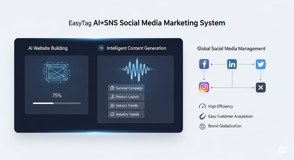
 AI+SNS Social Media Marketing SystemYingbao AI+SNS Social Media Marketing System - Precision social capture for the social media era. Supports one-click content synchronization across major platforms like Facebook and LinkedIn. AI intelligently rewrites posts for enhanced relevance. 24/7 AI customer service and user profiling analysis empower businesses to efficiently expand into global markets.
 AI+SEO营销解决方案易营宝AI+SEO营销解决方案,通过AI批量写作、智能生成TDK、精准关键词扩词等功能,全面优化网站SEO效果,提升流量与转化率。助力企业构建高效智能网站新生态。
 AI+SEM Advertising Marketing SolutionsAI+SEM Advertising Marketing Solution leverages AI technology to deeply empower SEM ad campaigns. It automatically generates weekly/monthly reports using AI, presenting account data across multiple dimensions for comprehensive insights into campaign performance and trends. The system precisely recommends keywords and target countries, intelligently generates high-conversion ad copy, and enables one-click activation of efficient campaign plans to help businesses rapidly acquire customers. Simultaneously, it monitors core metrics in real time, intelligently identifies abnormal fluctuations, and issues timely alerts to ensure stable, high-return advertising results.
 Domain Name ServicesEasyWin provides professional domain name services, including intelligent queries, one-stop registration, brand protection, and full lifecycle management, helping businesses build a digital brand image.
 EasyOperate B2C Cross-Border E-Commerce Platform & Independent WebsiteEasyStore B2C Cross-border E-commerce Independent Store is an intelligent website building and cross-border e-commerce integrated solution independently developed by EasyStore Information Technology (Beijing) Co., Ltd. The system is specially designed for small and medium-sized as well as large export enterprises, integrating 'website building, operation, marketing, advertising, and conversion' into one, helping enterprises quickly establish cross-border e-commerce independent stores to achieve brand globalization and global sales growth.
The platform supports multiple languages, multiple currencies, and multi-channel marketing, with built-in AI intelligent translation and SEO optimization systems, suitable for mainstream markets such as Southeast Asia, Europe and America, Latin America, and the Middle East, assisting Chinese manufacturing enterprises in efficiently deploying international e-commerce strategies. SSL证书易营宝提供专业SSL安全证书服务,包括单域名和泛域名证书,确保网站数据传输加密、身份验证和完整性保护,助力企业建立安全可信的在线业务环境。