
Feature Introduction
Collapsible components can be nested within other controls to save page space, reduce overall length, enhance design aesthetics, and provide selective browsing for website visitors.
Usage Process
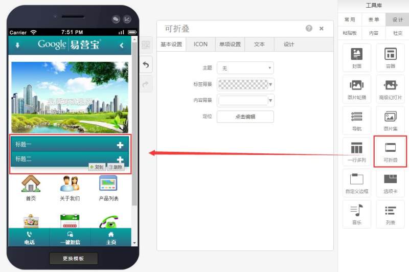
Step 1: Drag a collapsible component to the desired page as shown below:
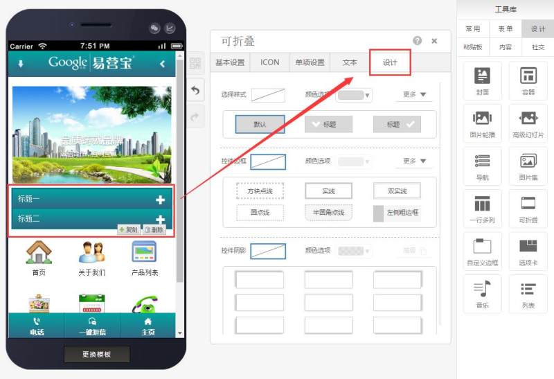
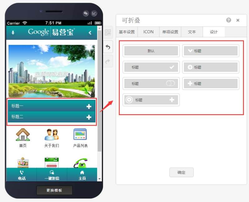
Step 2: Locate design options according to your needs and select a collapsible style (7 styles available) as shown below:
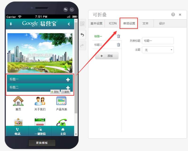
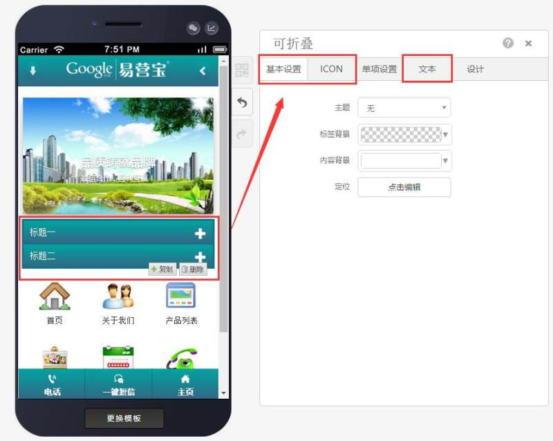
Step 3: After selecting the style, configure individual settings (edit collapsible title and subject) as shown below:
Step 4: After completing individual settings, finalize basic configurations including text attributes, icon colors, and sizes.
Online Inquiry
